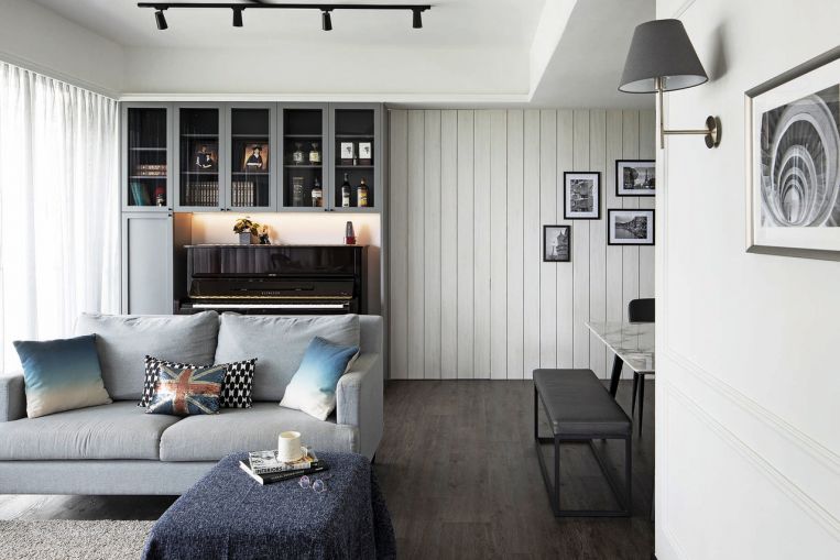
SINGAPORE – Looking at the photos of this four-room condominium apartment near Bukit Panjang, one would not guess it is home to the parents of two young children.
The design exudes cool masculinity. And the home’s dominant colour palette is white, usually a nightmare to keep pristine around little ones.
The brief called for plenty of common spaces to mingle and play in, storage to keep things uncluttered, as well as a larger kitchen because the owners love to cook and found the existing kitchen too small.
The owners – who declined to be identified – spent $120,000 on the renovation of the 1,400 sq ft apartment, which took 21/2 months. The family moved into the home in July 2019.
The team from local interior design studio KNQ Associates, which was hired for the renovation, says: “The home owners’ love for the cottage style underpins the design direction.
“The general colour scheme is kept neutral with white as the main colour, plus greys and blacks to maintain a clean look reminiscent of traditional American homes and in line with the owners’ tastes.”
The look in question is the Shaker style, which emerged in the 1800s and is characterised by simplicity and functional minimalism.
It is practised to this day by the American community of the same name, dubbed the world’s original practitioners of minimalism for their belief in making every element of a home – especially furniture and homeware – simple, unadorned and durable.
“We aimed for a wholesome look with every element in the house integrated cohesively. Once inside, you are transported to another world. We wanted it to feel like an old family cottage from the suburbs that’s a little classic and a little vintage,” say the designers.
This can be seen in spaces like the living room, with simple wall trimming and wood panelling that conceal the husband’s “man cave”-cum-home office. The attached bathroom is also in a darker colour scheme.

The dark, wenge wood-looking wood plastic composite flooring is uniform throughout the home, creating flow between areas and contrast to the white walls.
The furniture is a mix of old and new, with some pieces from the family’s previous home.
“Most of the pieces are not overly expensive, but they suit the look,” say the designers. “Many, including a few pieces from Ikea, were sourced locally. As with most of our projects, we source for the furniture, but we loved working with what they already have.”

There were also a few architectural alterations made.
For instance, a toilet at the back was removed to make room for a bigger kitchen, and what used to be the yard area is now a storeroom.
The wall separating the master bedroom and its attached bathroom was hacked, and the latter’s size was reduced to make room for a sit-down dresser for the lady of the house.

To accommodate this, the original bathtub was replaced with a shower. Clad in off-white, the bathroom is now both space-efficient and luxurious.
The cosy living and dining area is where the family gets together while enjoying the view of the greenery outside.

•This article first appeared in the May 2021 issue of Home & Decor, which is published by SPH Magazines.
• Get the July and latest issue of Home & Decor now at all newsstands or download the digital edition of Home & Decor from the App Store, Magzter or Google Play. Also, see more inspiring homes at Home & Decor’s website.


