Microsoft Corp.’s
new Windows 11, coming later this year, is fairly similar to its well-received predecessor Windows 10—good news for users who don’t want to relearn the operating system from scratch, as they had to do with some previous incarnations.
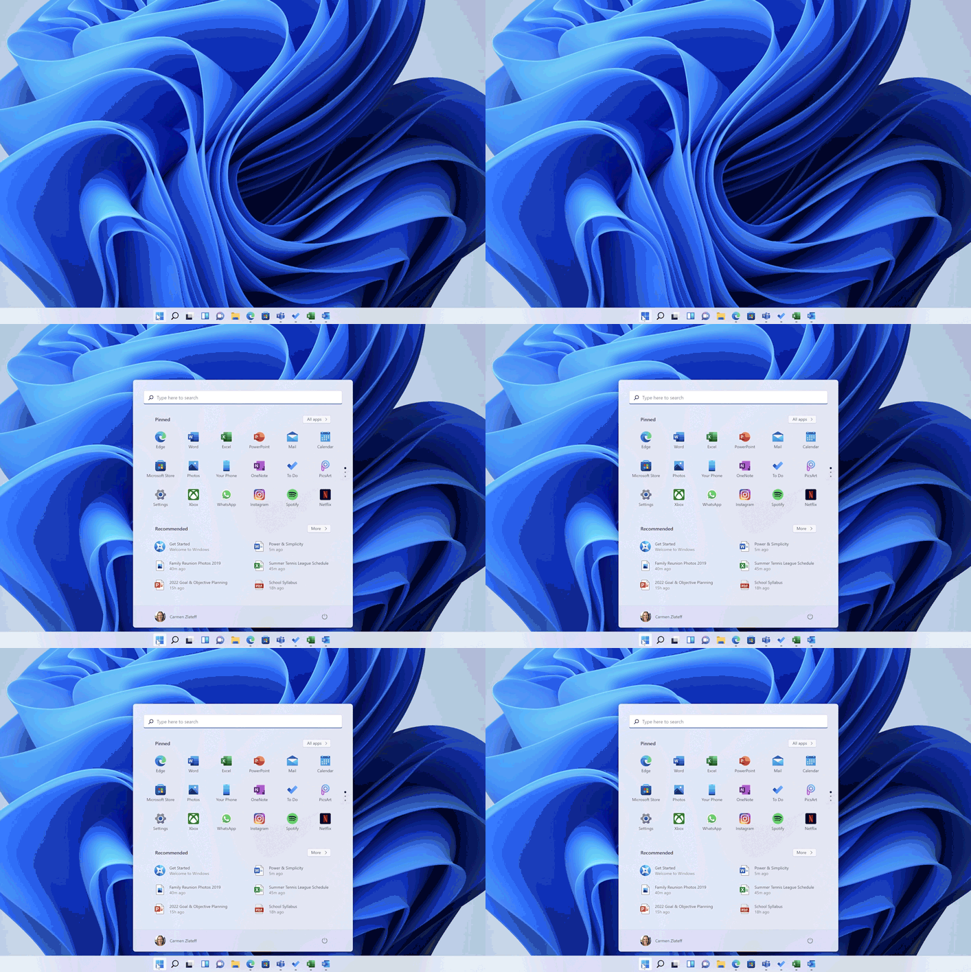
But it will come with one significant, visible difference: the repositioning of the start button and the menu it opens. Previously consigned to the bottom-left corner of the screen (or bottom-right, if the system language is set to Arabic), the four squares of the Windows logo will now sit in the center of the taskbar—though users have the option of moving it to the old position.
The change came after years of research and testing by a team of about 40 Microsoft designers.
Two members of that team—Principal Design Director Diego Baca and Senior Program Manager Eric Papamarcos—spoke to the Experience Report about how they designed the start interface. The interview has been edited for length and clarity.
WSJ: Before you’d sketched any designs or built any prototypes, how did you want Windows 11 to look and feel different from its predecessor?

Diego Baca, Microsoft’s principal design director, worked with a team of around 40 to create the look of Windows 11.
Photo:
Microsoft
Mr. Baca: We released Windows 10 in 2015—in tech years, that’s ages ago. But in the past 18 months especially, we noticed that the PC has moved from something that was more practical or functional to something that’s more personal and emotional: Before, you might have gone to your office and used your computer for a few hours, but then you had meetings, lunch breaks, time to call your family…All of that is happening in front of a computer these days.
In order to learn about that shift we did 85 research studies, we talked to hundreds of people and went through thousands of hours of testing rounds. We talked to diehard Windows fans, who sometimes know the system better than us, and we talked to people who might have not used Windows before.
One of the biggest themes that came out of that was users wanting calm technology. They don’t want any extra stress; it’s like, my computer just needs to work. It hinges on that ability of feeling in control, feeling at ease, feeling trustful of the thing that you’re using.
WSJ: Can you tell me more about that user testing? What did it look like, especially pertaining to the start button and menu?
Mr. Papamarcos: We do preference studies, where we ask people basically to choose between two designs, and we do usability studies, where people are asked to carry out a specific task, like finding an app.

Senior Program Manager Eric Papamarcos is now analyzing feedback on the Windows 11 interface, provided by members of Windows’ Insider feedback group.
Photo:
Microsoft
One of the most memorable studies for me was what’s called a co-creation study. We printed out these pieces of paper that represented building blocks—so that would be things like the search box, your top apps, websites, files, the weather, upcoming calendar appointments—laid them all on the table, and we had them arrange them into their ideal launching space.
No two were exactly the same. But they all had a lot of things in common, and one of our biggest insights was they wanted the start menu to not just give them quick access to apps, but quick access to documents and files, too. We were already thinking about doing that, so because of that study, we knew we were on the right track.
WSJ: So, after all that, who was the first person to go, “Let’s put the start button in the center!”
Mr. Baca: I don’t know if I can pinpoint one specific person but I do remember we wanted to make sure that the start button felt efficient, and we also noticed Windows has become more flexible in terms of the devices that it’s used on: from tiny tablets to PCs to these gigantic, 50-inch, ultra-wide monitors.
And when you have these giant monitors, the button is no longer in the periphery—you need to actually travel in order to interact with the button. So we wanted to put the menu in the center…not shoved into a little corner, where sometimes people might miss it.
WSJ: Now that Windows 11 design is complete, what is your team working on now? Windows 12?
Mr. Papamarcos: Windows 11 builds have gone out to Windows Insiders [members of Windows’ user feedback program], who are able to provide feedback…We’re reading all the feedback, and looking for themes and ways we can tweak and optimize things, and address anything that’s broken.
It doesn’t stop just because we put it out the door.
Write to Katie Deighton at katie.deighton@wsj.com
Copyright ©2021 Dow Jones & Company, Inc. All Rights Reserved. 87990cbe856818d5eddac44c7b1cdeb8


